Heroku: https://dash-app-murder.herokuapp.com
Homicides in the United States is an important topic to think about. Compared to other high-income countries, the US contains greater homicide rates (e.g. gun homicides, https://pubmed.ncbi.nlm.nih.gov/30817955/). Because homicides can cause significant negative effects (e.g. loss of life), it may be important to investigate ways to reduce the negative effects of homicides.
One way to address the negative effects of homicides in the US may be to provide general education about homicides. General education can be helpful in at least two ways: 1) For everyday citizens, awareness about homicides (e.g. what types of crimes are likely to be committed, in which regions), may increase citizens’ abilities to prepare and defend themselves against attacks. 2) For people working in crime-related areas (e.g. law enforcement), information about homicides may increase their ability to pinpoint and reduce criminal activity.
Therefore, the aim of the current project is to create tools that could provide education about homicides in the US. Specifically, we will create an interactive dashboard investigating homicide-related data from the 2010’s to 2014s. This dashboard could be used to provide insights into relevant questions, such as examining how homicide-related activity is distributed geographically across the US.
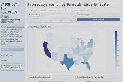
The first tab is designed to mainly demonstrate the geographical distribution of homicide over America, with a date selection component, a drop-down menu to filter weapon categories and a bar chart to summarize race and gender aggregation. By using this tab the user can easily filter out the interested subset and observe how those cases are distributed geographically.
The second tab is to show the frequency of homicide is regulated by season or month. By changing the drop-down menu, users can select the cases given specific relationship, weapon, crime type and state.
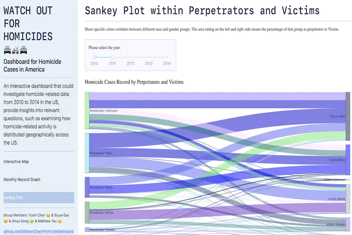
The third tab aims to show specific crime corridors between different race and gender groups. The area sitting on the left and right side means the percentage of that group as perpetrator or Victim. The width of the line connecting each group indicates the count of cases.